
You check the weather app every morning, but that only tells you about today. What if you wanted to know what summer felt like in your town 10,000 years ago? Or how fast the Arctic warmed during the last ice age retreat? The instruments we rely on today—thermometers, satellites, buoys—only go back about 170 years. Everything before that requires a different approach.
Historical temperature data comes from the Earth itself. It’s written in tree rings, locked in ice, buried in ocean mud, and etched into cave formations. Reading that archive takes patience and statistical rigor, but the payoff is enormous. This article walks you through how scientists reconstruct past temperatures, why those reconstructions matter for today’s climate models, and how you can pull the raw data yourself to check the work.

YoLink
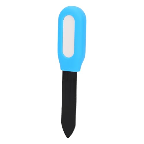
YoLink X3 Outdoor Thermometer Hygrometer Data Logger,…
- Monitor & Manage Temperature & Humidity Remotely: using the free, no subscription-required and user-friendly YoLink app, you will…
- Be Informed of Abnormal Conditions: receive smartphone push notifications, email, SMS notifications when a condition you have set…
- Commercial Grade Accuracy and Environmental Range: designed with home and business applications in mind, precision components are…
You’ll learn the strengths and weaknesses of each proxy, how they get stitched into a single global curve, and why the Arctic warms twice as fast as the rest of the planet. By the end, you’ll be able to look at a paleoclimate chart and understand what it actually means—not just nod along.
If you’re the kind of person who likes to see data with your own eyes, a home weather station helps you start your own record. The YoLink X3 Outdoor Temperature and Humidity Sensor logs readings every few minutes and stores them in the app, so you can track your own microclimate while you learn about the planet’s long-term trends. It’s not a substitute for a research-grade station, but it’s a practical way to build a personal dataset.

What Is Historical Temperature Data and Why Does It Matter?
Historical temperature data means any measurement or reconstruction of temperature before the modern instrumental record began. The instrumental record—actual thermometers in weather stations—starts around 1850 for most of the globe. Before that, we rely on natural recorders called proxy data.
Proxies are indirect measurements. No one stuck a thermometer in the ground 50,000 years ago. Instead, we measure things that change predictably with temperature: the width of a tree ring, the ratio of oxygen isotopes in ice, the species of plankton in a marine sediment core. Each proxy has its own quirks, resolution, and time span. None is perfect alone. Together, they form a mosaic that covers the last 2.6 million years—the Pleistocene and Holocene epochs—with varying detail.
Why bother? Because you can’t understand the present without a baseline. The global average temperature has risen about 1.2°C since pre-industrial times. Is that fast? Is it unusual? The only way to answer those questions is to compare it to natural variability over centuries and millennia. The data shows that the current warming rate is roughly ten times faster than the warming that ended the last ice age. That’s a fact you can’t get from a thermometer record alone.
The Core Toolkit: Ice Cores, Tree Rings, and Ocean Sediments
Each proxy records temperature differently, and knowing how helps you interpret the resulting curves. Let’s walk through the main players.
How Each Proxy Records Temperature Differently
Ice cores come from polar ice sheets and high mountain glaciers. When snow falls, it traps air bubbles. The ice itself is made of water molecules containing oxygen isotopes—mostly oxygen-16, with a small fraction of the heavier oxygen-18. In colder times, the heavier isotope condenses out earlier in the atmospheric cycle, so the ice that forms has less oxygen-18 relative to oxygen-16. Measuring that ratio gives a direct estimate of the temperature when the snow fell. Ice cores from Antarctica go back 800,000 years. They also trap ancient air, so you get carbon dioxide and methane concentrations from the same ice. That’s a unique combination—temperature and greenhouse gases from the same sample, with no assumptions about correlation.
Tree rings are higher resolution but shorter. Each year a tree adds a ring. In most species, ring width correlates with growing-season temperature and moisture. But it’s not a pure temperature signal—a dry year can produce a narrow ring even if it was warm. Dendroclimatologists use a technique called standardization to remove age-related growth trends, then compare ring widths across many trees to isolate the climate signal. Tree-ring records typically reach back 500 to 2,000 years, with some bristlecone pine chronologies exceeding 8,000 years. Resolution is annual, sometimes even seasonal, which makes them excellent for studying decadal variability like the Medieval Warm Period or the Little Ice Age.
Marine sediments give us the longest view. Ocean floors accumulate layers of microscopic shells from foraminifera—tiny plankton that build shells from calcium carbonate. The ratio of oxygen-18 to oxygen-16 in those shells depends on both water temperature and ice volume. Because ice sheets lock up the lighter isotope, a glacial period shows up as a shift in the ratio. Sediment cores can reach back millions of years, but resolution is coarse—often a few hundred to a few thousand years per sample. They’re the backbone of our understanding of glacial-interglacial cycles.
Other proxies fill in the gaps. Boreholes measure the temperature gradient in deep rock. The Earth’s crust retains a memory of past surface temperatures, so drilling down and measuring the curve gives a continuous temperature history for the last few centuries to a millennium. Corals provide annual resolution in tropical oceans, recording both temperature and salinity. Speleothems—cave formations like stalagmites—record oxygen isotopes in their growth layers, offering a rainfall and temperature record that can span hundreds of thousands of years.
From Raw Signals to Global Curves: The Calibration Process
Raw proxy measurements aren’t temperature. A tree ring width of 1.2 millimeters doesn’t tell you the temperature was 14.3°C. The conversion requires calibration—finding a statistical relationship between the proxy and actual temperature over a period where both exist.
The standard method is to take the last 100–150 years of instrumental data, compare it to the proxy record over the same window, and fit a linear or nonlinear model. That model then converts the older proxy values into temperature estimates. This sounds straightforward, but it’s full of traps. The relationship might not be stable over time. A tree that’s sensitive to temperature now might have been more sensitive to moisture 500 years ago. Calibration also assumes the proxy responds to temperature the same way at all magnitudes—that the relationship doesn’t break down when temperatures exceed anything in the calibration period.
The Statistical “Glue” That Combines Proxies
Once you have multiple proxy records, each with its own units, noise level, and geographic coverage, you need a way to merge them. This is where principal component analysis (PCA) comes in. PCA finds the dominant patterns of shared variance across all the records. The first principal component is often interpreted as the global or regional temperature signal, because it captures the pattern that moves in sync across many sites.
But PCA has a known weakness: it can overfit noise when the number of proxies is small, especially in the early part of the reconstruction. That’s why modern reconstructions use multiple methods and compare results. The signal-to-noise ratio matters here. Each proxy has a climate signal and measurement noise. If the noise is too high relative to the signal, the reconstruction becomes unreliable. Researchers often screen proxies by their correlation with instrumental temperature during the calibration period, keeping only those with a signal-to-noise ratio above a threshold.
The result is a composite curve like the famous hockey stick—a long flat handle during the last millennium, then a sharp upward blade in the 20th century. The handle isn’t perfectly flat; it shows the Medieval Warm Period around 1000–1200 CE and the Little Ice Age from roughly 1450–1850. Those fluctuations were real but modest—likely a few tenths of a degree globally. The blade is different. It’s a rise of over 1°C in a century, with no precedent in the last 2,000 years.
What the Data Reveals: The Pace of Modern Warming vs. The Past
Here’s where the forensic aspect gets interesting. The last deglaciation—the transition from the last glacial maximum about 20,000 years ago to the warm Holocene—involved a global temperature rise of roughly 4–5°C. That sounds similar to what we might see by 2100 if emissions continue. But the pace is completely different.
The deglaciation took about 10,000 years. That’s an average warming rate of about 0.04°C per century. The current warming rate is about 0.2°C per decade—roughly 50 times faster. Even during the most abrupt warming events in the paleoclimate record, like the Dansgaard-Oeschger events that saw Greenland temperatures jump by 10°C in a few decades, the global average changed much more slowly. The current global warming is faster than any global-scale temperature change in at least the last 66 million years, based on the best available proxy evidence.
This matters because ecosystems and human infrastructure adapt to gradual change. A forest can migrate over centuries. A coastal city cannot relocate in decades. The climate sensitivity—how much warming results from a doubling of atmospheric carbon dioxide—is estimated from paleoclimate data to be between 2.5°C and 4°C. That range comes directly from studying past periods when CO2 was higher, like the mid-Pliocene about 3 million years ago, when CO2 was around 400 ppm and global temperatures were 2–3°C warmer than today.
The Earth’s energy budget explains why. Increasing greenhouse gases trap more outgoing longwave radiation. The imbalance is currently about 0.9 watts per square meter. That extra energy accumulates in the ocean, which absorbs over 90% of it. Paleoclimate data shows the same physics operating in the past—when CO2 rose, temperatures followed, with a lag of centuries to millennia due to ocean thermal inertia.
Regional Patterns: Why the Poles and Tropics Tell Different Stories
Global averages hide the real drama. The Arctic warms about twice as fast as the global average, a phenomenon called polar amplification. Proxy data from ice cores and marine sediments shows this isn’t a new feature—it happened during the last deglaciation too, when Greenland warmed several degrees faster than the global mean.
The mechanism is straightforward. When snow and ice melt, the surface becomes darker, absorbing more sunlight instead of reflecting it. This is the albedo feedback. Warmer air also holds more water vapor, another greenhouse gas, which amplifies warming further. The Arctic is also where ocean heat is released to the atmosphere during winter, as sea ice retreats and exposes open water. Proxy evidence from sediment cores in the Bering Sea and the Nordic Seas shows that during past warm intervals, sea ice retreated hundreds of kilometers further north than today—and that the rate of retreat was fastest when global temperatures were rising most quickly.
The tropics, by contrast, show muted temperature changes. Ice-age tropical sea surface temperatures were only about 2–3°C cooler than today, compared to 8–10°C cooling at high latitudes. This gradient matters because it drives the jet stream and storm tracks. A weaker pole-to-equator temperature difference in the past meant a more meandering jet stream, which likely caused more persistent weather patterns—longer droughts, longer floods. We’re seeing hints of that today, with more frequent blocking patterns in the Northern Hemisphere.
For a practical look at how daily temperature patterns interact with larger climate trends, check out this piece on daily temperature patterns. It connects the micro-scale readings you might log at home with the macro-scale dynamics that drive regional climate.
Using the Past to Test Future Climate Models
Climate models are not just run forward to make projections. They’re also run backward, to simulate past climates, and the results are compared to proxy reconstructions. This is the single most powerful validation tool we have.
If a model can’t reproduce the warmth of the mid-Holocene (about 6,000 years ago, when orbital forcing made northern hemisphere summers warmer) or the cooling of the Last Glacial Maximum, then its projections for the future carry less weight. The Paleoclimate Modelling Intercomparison Project (PMIP) coordinates these experiments. Models participating in PMIP must simulate the Last Glacial Maximum, the mid-Holocene, and the last millennium. The last millennium is especially useful because it includes both natural forcing (volcanic eruptions, solar variability) and early anthropogenic effects, providing a rigorous test of how models handle radiative forcing and natural variability.
The results are encouraging but not perfect. Most models reproduce the broad features of the last millennium—the Medieval Warm Period, the Little Ice Age, the 20th-century rise. But they often underestimate the magnitude of regional changes, particularly in the tropics and the polar regions. This suggests some feedbacks are weaker in the models than in reality. For example, models tend to underestimate the extent of sea ice during the Last Glacial Maximum, which implies the ice-albedo feedback may be too weak in some models.
That’s not a reason to dismiss the models. It’s a reason to take their projections seriously with a margin of error. The fact that models can’t fully reproduce past polar amplification means they may be underestimating future Arctic warming. The projections that show 4°C of Arctic warming by 2100 under a high-emissions scenario might actually be conservative.
The Blind Spots: Limitations and Uncertainties in the Record
Historical temperature data has real limitations, and pretending otherwise does no one any favors. The first is resolution. Tree rings give you annual detail, but only for the last few thousand years and only on land. Ocean sediments give you global coverage but blur everything into centuries. There’s no single proxy that gives you both deep time and fine detail.
The second issue is spatial coverage. The Southern Hemisphere is severely under-sampled in the pre-instrumental record. Most tree-ring chronologies come from North America and Europe. Ocean sediment cores are concentrated in the North Atlantic. The deep Southern Ocean, which plays a huge role in the global carbon cycle, has very few high-resolution records. This geographic bias means global reconstructions are essentially Northern Hemisphere reconstructions with a correction factor.
The third problem is the calibration itself. Proxies are calibrated against the instrumental record, which covers a period of rapid warming. If the proxy’s response to temperature is nonlinear—meaning it responds differently at high temperatures than at low ones—the calibration will be biased. This is a known issue with tree rings, where drought stress can override temperature signals during warm periods, producing a flattened response.
Finally, there’s the problem of greenhouse gases and radiative forcing in the deep past. Ice cores give us precise CO2 concentrations for the last 800,000 years. Beyond that, we rely on indirect estimates from boron isotopes in marine carbonates, which carry larger uncertainties. So while we know CO2 was higher during the Pliocene, the exact value is less certain, which widens the error bars on climate sensitivity estimates.
None of these limitations invalidate the broad conclusions. The direction of change, the approximate magnitude, and the unprecedented pace of modern warming are all robust across multiple independent proxies and methods. But the exact numbers—whether the Little Ice Age was 0.4°C or 0.7°C cooler than the mid-20th century—remain uncertain.
How to Access and Explore the Raw Data Yourself
You don’t need a lab to see the evidence. The raw datasets are public, and with a little patience, you can pull them up and make your own plots.
The National Oceanic and Atmospheric Administration (NOAA) hosts the World Data Service for Paleoclimatology. That’s the main repository. You can browse by proxy type, location, or time period. The PAGES2k consortium has compiled a global database of temperature-sensitive proxy records covering the last 2,000 years, with over 700 individual records. Each record includes the raw measurements, metadata about the site, and the calibration information. Downloading is free, no registration required.
For the instrumental record, the best starting point is the Berkeley Earth dataset, which combines over 40,000 weather stations into a global temperature series. The data is updated monthly and available in plain CSV format. NASA’s GISTEMP and NOAA’s GlobalTemp are alternatives. The three datasets agree on the broad trends—the differences are in the details, like exactly how much the Arctic warmed in the 1930s.
If you want to analyze the data without learning to code, try the Climate Explorer from the Royal Netherlands Meteorological Institute. It lets you plot time series, compare different datasets, and even compute correlations between temperature and CO2. For a deeper dive, the KNMI Climate Explorer allows you to run principal component analysis on any set of proxy records—the same technique used in the scientific literature.
One word of caution: the raw data is messy. Missing values, inhomogeneities, and station moves are common. The processed datasets have been cleaned and homogenized, but the raw files will test your patience. Start with the processed versions if you’re new to this. If you want to understand how to read sensor data properly, including the pitfalls of calibration, this guide on reading temperature sensor data covers the basics.
Comparing Reconstruction Methods: Strengths and Trade-offs
Not all reconstructions are created equal. The table below summarizes the main approaches scientists use to combine proxies into a global temperature curve.
| Method | How It Works | Strength | Weakness |
|---|---|---|---|
| Composite Plus Scale (CPS) | Averages all proxy records, then scales the average to match instrumental variance | Simple, transparent, easy to reproduce | Ignores spatial weighting; sensitive to outliers |
| Principal Component Regression (PCR) | Reduces proxies to dominant modes via PCA, then regresses those modes on temperature | Handles multicollinearity well; captures common signal | Can overfit noise when proxies are few; sensitive to the number of PCs retained |
| Climate Field Reconstruction (CFR) | Uses spatial patterns from instrumental data to infill missing proxy locations | Produces maps, not just global averages; preserves regional detail | Computationally heavy; assumes spatial patterns are stable over time |
| Bayesian Hierarchical Models | Models the proxy-temperature relationship and the spatial field jointly, with explicit priors | Quantifies uncertainty rigorously; handles missing data well | Complex to implement; results depend on prior choices |
Each method has its defenders and critics. The best reconstructions run multiple methods and check where they agree. Where they disagree, that’s where the uncertainty lies.
Five Questions People Ask About Historical Temperature Data
How accurate are temperature reconstructions from 1,000 years ago?
The uncertainty varies by region and time period. For the global average, the margin of error is roughly ±0.2°C for the last 2,000 years. That’s good enough to distinguish the Medieval Warm Period from the 20th century. For specific regions, especially the Southern Hemisphere, the error bars can be twice as wide. The key point is that the current warming is well outside the range of uncertainty—it’s not a statistical artifact.
Can tree rings really tell us temperature, not just rainfall?
Yes, but it depends on the site. Trees at high latitudes or high elevations are typically limited by temperature, so their rings reflect warmth. Trees in dry regions are limited by moisture. The trick is choosing sites where temperature is the limiting factor, then verifying the relationship against instrumental data. Modern studies also use wood density, not just ring width, because density has a stronger and more direct relationship with temperature.
Why don’t scientists just use historical records like diaries and ship logs?
They do, but those records are sparse and inconsistent. Ship logs from the 18th and 19th centuries give sea surface temperature readings, but the methods changed over time—canvas buckets vs. engine intake readings produce different biases. Diaries and harvest dates give qualitative information, like whether a river froze or a harvest came early. These are useful for checking reconstructions, but they can’t provide the quantitative spatial coverage that proxies do.
How far back can we reliably reconstruct global temperature?
With confidence, about 2,000 years using tree rings, ice cores, and corals. With reduced confidence, 800,000 years using ice cores and marine sediments. Beyond that, we have estimates from ocean sediment cores and geological evidence, but the resolution drops to thousands or tens of thousands of years per sample. The further back you go, the fewer data points and the larger the uncertainty.
Does the paleoclimate record show any period warmer than today?
Yes, but not in the recent past. The Eemian interglacial, about 125,000 years ago, was roughly 1–2°C warmer than today globally, and sea levels were 5–10 meters higher. The Pliocene, about 3 million years ago, was 2–3°C warmer. But those periods had CO2 levels of 280–400 ppm, and the warmth was driven by different orbital configurations. The current CO2 level of over 420 ppm is already higher than anything in the last 800,000 years, and the warming is happening faster than in any of these past events.
What You Can Actually Do With This Knowledge
The takeaway isn’t just academic. Understanding how historical temperature data reveals climate patterns changes how you think about risk.
- If you’re planning infrastructure, don’t rely on the 100-year flood plain map from 1980. The data shows that the frequency of extreme rainfall events is shifting, and the past is no longer a reliable guide.
- When you read a climate headline, check whether it’s based on the instrumental record or a proxy reconstruction. The two have very different resolutions and uncertainties.
- If you manage a farm or garden, use the regional paleoclimate data to understand the range of natural variability. A single dry decade isn’t necessarily a trend.
- For anyone building a home weather station, start logging now. Your records will be part of the instrumental record that future scientists use to calibrate new proxies.
- When evaluating climate models, remember that the best models are tested against the past. A model that can’t reproduce the Little Ice Age isn’t ready for the future.
- The Arctic is the canary. If you hear about a record low sea ice extent, know that the paleoclimate record shows this is unprecedented in at least 1,000 years, and likely longer.
- Finally, the data is yours to check. The NOAA and PAGES2k databases are free, and the methods are published. You can verify the claims yourself, which is more than you can say for most scientific fields.
Historical temperature data isn’t a curiosity. It’s the baseline that makes sense of the present and the test bed that validates our models of the future. The Earth has kept its records faithfully. The question is whether we read them well enough to act.

I am a mechanical engineer and love doing research on different home and outdoor heating options. When I am not working, I love spending time with my family and friends. I also enjoy blogging about my findings and helping others to find the best heating options for their needs.
Related guides

How To Measure Daily Temperature Changes Accurately
You check the thermometer on your porch and it reads 96°F. The local weather station says 89°F. Your…

How Temperature Swings Accelerate Snowmelt Patterns
Daily temperature fluctuations significantly influence snowmelt patterns by causing variations in melting rates, affecting water availability and ecosystem…
Natural Factors That Cause Daily Temperature Changes
Natural factors influencing daily temperature fluctuations include solar radiation, cloud cover, wind patterns, and geographical features like mountains…