You’ve got a dead spot in the home office. Video calls freeze every afternoon. The smart TV in the bedroom buffers even though the router sits twenty feet away. You’ve rebooted the router, moved it to a shelf, even bought a new one. Nothing worked because you were guessing. A WiFi heat map app replaces that guesswork with a visual, data-backed picture of your coverage. It shows you exactly where signal strength drops, where interference lives, and what to change.
This article walks through how heat mapping works, the signal metrics that matter, and which apps fit your skill level and budget. You’ll also get a step-by-step survey method that works for a small office or a typical home, plus how to read the colors on the map so you’re not just staring at a pretty picture. By the end, you’ll know how to find the best WiFi heat map apps for optimal network coverage and actually use one to fix your network.
Heat Storm
Heat Storm HS-1500-PHX-WIFI Infrared Heater, Wifi Wall…
- (Wall Mounted Heater Only.) Wi-Fi enabled makes it possible for you to control the temperature from your phone!
- Tip-Over safety shut off, Touch screen with digital thermostat, and remote included.
- Space saving wall mount design means you don't lose floor space. Perfect for bedrooms, kitchens, offices and more
While you’re sorting out your network, here’s a small tangent that might matter: the Heat Storm HS-1500-PHX-WIFI Infrared Heater is a wall-mounted unit with WiFi controls. It’s a handy way to manage room temperature from your phone alongside your network gear, and since it mounts over an outlet, it keeps floor space clear. Not the point of this article, but a useful piece of hardware if you’re already fiddling with a phone app to control your environment.

What is a WiFi Heatmap and Why You Need One
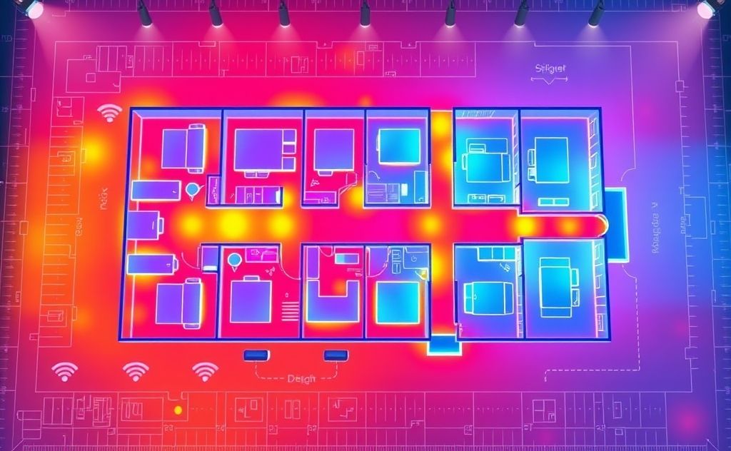
A WiFi heatmap is a visual representation of your wireless signal across a physical space. The app takes a floor plan, divides it into a grid, and colors each cell based on measured signal strength. Green means strong, red means weak or dead, and the gradient in between shows you the transition zones.
Why bother? Because your router’s placement is the single biggest factor in coverage quality, and most people place it based on convenience, not physics. A heatmap shows you the actual coverage pattern, which rarely matches the mental model you have. Walls absorb signal. Microwaves and Bluetooth devices interfere. The 2.4 GHz band reaches further but carries less data; the 5 GHz band is faster but dies at the first brick wall. A heatmap makes those effects visible.
The practical payoff is concrete. You’ll know whether moving the router two feet fixes the dead zone or whether you need a mesh node. You’ll stop buying range extenders that don’t help. You’ll see the difference between a weak signal and a noisy one, which changes your troubleshooting path entirely.
Heat mapping isn’t just for IT pros. Modern apps have made the process simple enough for a homeowner with a laptop and an afternoon. The results are the same: a map that tells you exactly where to put hardware and what to change.
How WiFi Heatmap Apps Work (Signal Metrics Explained)
Every heatmap app works the same basic way. You load a floor plan, walk around with a laptop or phone, and the app records signal samples at each location. Then it interpolates between those samples to build a continuous color surface. The quality of that map depends on two things: how many samples you take and how accurately the app measures the signal.
The sampling method matters. Passive scanning listens to beacons broadcast by access points without connecting to them. It’s fast and can see multiple networks at once, but it doesn’t measure your actual data throughput. Active scanning connects to a specific network and sends test traffic, which measures real-world performance including latency and packet loss. Most good apps do both, but you need to know which mode you’re using to interpret the results.
Here’s the part most guides skip: the accuracy of your map depends on your hardware. A laptop with a decent WiFi card gives you consistent, repeatable measurements. A phone gives you convenience but its antenna orientation changes as you walk, which adds noise to the data. For a professional site survey, you want a laptop. For a quick home check, a phone app is fine.
Key Metrics: RSSI, SNR, and Interference
Three numbers drive every heatmap: RSSI, SNR, and interference. You’ll see these in the app’s data view, and understanding them matters more than the colors.
RSSI (Received Signal Strength Indicator) is the raw power of the signal you’re receiving, measured in dBm. It’s a negative number, and closer to zero is better. Here’s the practical scale:
- -30 to -50 dBm: Excellent. You’re basically next to the access point.
- -50 to -60 dBm: Good. Reliable for streaming and video calls.
- -60 to -67 dBm: Fair. Fine for browsing, but video may stutter.
- -67 to -70 dBm: Poor. Expect dropped connections and slow speeds.
- Below -70 dBm: Dead zone. Your device will constantly hunt for a better signal.
SNR (Signal-to-Noise Ratio) is the difference between your signal and the background noise floor, measured in dB. A high SNR means a clean signal. Below 20 dB, you’ll see performance issues even if RSSI looks okay. This is the metric that catches interference from neighboring networks or household appliances.
Interference is the noise floor itself. In a dense apartment building, your neighbors’ routers all compete for the same channels. A heatmap that only shows signal strength will look fine, but the SNR layer will reveal the real problem. That’s why you should always look at both the signal map and the noise map before changing hardware.
One more thing: RSSI and SNR don’t tell you about bandwidth. You can have a perfect signal and still get slow speeds if the access point is congested. For a complete picture, run a speed test at the same locations where you take signal samples. Most apps let you log throughput data alongside signal data, and that combination is what actually solves real-world problems.
Top WiFi Heatmap Apps Compared (Free vs. Paid)
The app you choose depends on your goal. A homeowner checking one floor needs something different from an IT team managing a warehouse. Here’s the honest breakdown of what’s out there and what it costs.
Best for Home Users: NetSpot and Acrylic
NetSpot is the most approachable option for home users. The free version handles basic surveys on a single floor plan and shows you the signal heatmap without much fuss. The paid version adds multiple floors, active scanning, and more detailed reports. It runs on both Windows and macOS, which is rare and convenient. The interface is clean, and you can be mapping within ten minutes of installing it. The downside: the free version’s resolution is coarse, so you’ll see the general shape of your coverage but not fine details.
Acrylic WiFi is a solid alternative, especially if you’re on Windows. Its free version includes a heatmap tool, though it’s a bit more technical than NetSpot. You get detailed channel analysis and a list of nearby networks with their signal strengths. The paid version adds live monitoring and more export options. Acrylic feels more like a professional tool that happens to have a free tier, which is great if you like digging into raw data.
Both apps have a learning curve, but it’s shallow. You’ll spend more time walking around with your laptop than figuring out the software.
Best for Enterprise: Ekahau and TamoGraph
Ekahau is the industry standard for professional site surveys. It’s what network engineers use to design and validate WiFi deployments in hospitals, schools, and office buildings. The software is powerful, with predictive modeling that lets you simulate access point placement before you install anything. It also handles massive floor plans with hundreds of access points. The cost is significant, and it requires training to use well. If you’re managing a network with more than a few access points, the investment pays for itself in avoided troubleshooting time.
TamoGraph is a strong mid-tier option. It’s less expensive than Ekahau but still professional-grade. It offers 3D visualization, which is genuinely useful for multi-story buildings, and it exports reports in formats your boss or client can actually read. The survey process is more manual than Ekahau, but the results are comparable for most projects. TamoGraph also has a free trial, so you can test it against your actual network before committing.
For most home users, these enterprise tools are overkill. The free versions of NetSpot or Acrylic will solve your dead zone problem. But if you’re planning a mesh network installation or troubleshooting a persistent issue in a building with multiple floors, the predictive features in Ekahau are worth the money.
How to Run a Successful WiFi Site Survey (Step-by-Step)
You don’t need professional hardware to get a useful heatmap. A laptop, a floor plan, and thirty minutes will do. Here’s the process I use for small offices and home setups.
- Get a floor plan. Draw it by hand or use a screenshot from a floor plan app. The only requirement is that it’s reasonably accurate. The app will let you calibrate distances, so you don’t need architectural precision.
- Pick a survey mode. Start with passive scanning to see all nearby networks. This tells you about interference from neighbors. Then switch to active scanning to measure your own network’s performance.
- Walk a grid pattern. Move slowly and steadily. Stop at regular intervals so the app captures samples at consistent spacing. For a typical room, that’s every 3 to 5 feet. Don’t walk in circles; a back-and-forth pattern covers the space evenly.
- Hold the device consistently. Keep the laptop at chest height, screen facing you. If you’re using a phone, hold it upright. Changing the device’s orientation changes the antenna’s reception, which adds error to the data.
- Cover every area you care about. That includes closets, bathrooms, and outdoor patios if you use WiFi there. Dead zones in a spare bedroom don’t matter until someone moves in.
- Note obstacles as you go. Mark thick walls, metal shelving, and appliances on the floor plan. The heatmap will show signal drops at these locations, and knowing what’s there helps you interpret the cause.
- Run a speed test at problem areas. When the heatmap shows a red zone, stand there and run a speed test. Note the throughput and latency. This tells you whether the problem is signal strength or something else, like channel congestion.
That’s the whole survey. The app does the heavy lifting; your job is to move through the space methodically. A sloppy walk produces a sloppy map, so take your time.
After you have the map, you can experiment. Move the router, add a mesh node, change channels, and re-run the survey. The before-and-after comparison is the most valuable output you’ll get.
Interpreting Your Heatmap: From Red to Green
The colors on a heatmap are not arbitrary, but they’re also not standardized across apps. Most apps use a gradient from red (worst) to green (best), with yellow and orange in between. Here’s how to read that gradient in a way that informs your next move.
Green means you’re in the -30 to -55 dBm range. This is your sweet spot. Devices here will perform at their best, with low latency and high throughput. If you’re designing a network, put your most demanding devices here: gaming PCs, video conferencing setups, streaming boxes.
Yellow to orange means you’re in the -55 to -67 dBm range. This is workable but not great. You’ll notice occasional slowdowns, especially during peak usage. This is the range where interference starts to matter. If your map shows a large orange area, check the SNR layer. If the noise floor is high, changing channels or moving the router a few feet could push that area into green.
Red means you’re below -67 dBm. This is where connections drop, video buffers, and smart home devices go offline. A red zone at the edge of your home is normal; a red zone in a central room means something is wrong. Look for thick walls, metal appliances, or a router that’s tucked behind a TV.
The key insight is that the gradient matters more than the absolute color. A gradual fade from green to orange as you move away from the router is normal. A sudden cliff from green to red on the other side of a wall tells you that wall is the problem. That distinction guides your fix: gradual fade means you need more coverage, a sudden cliff means you need to reposition the router or add a node on the other side of that wall.
One thing to watch out for: heatmaps interpolate between your sample points. If you took samples every 10 feet, the app is guessing at what happens in between. That guess is usually accurate, but it can miss small dead zones. If you find a spot that behaves badly but the map looks fine, go back and take more samples there.
Common Mistakes to Avoid When Mapping Coverage
Heat mapping is straightforward, but a few errors can ruin your results. Here are the ones I see most often.
Walking too fast. The app needs time to collect samples at each location. If you’re strolling through the room, you’ll get fewer samples and a blurrier map. Slow down to a deliberate pace and pause every few steps.
Mapping with the wrong device. A phone’s antenna is small and its orientation changes constantly. A laptop is more stable. If you’re doing a professional survey, use a laptop with a known-good WiFi card. If you’re just checking your home, a phone is fine, but understand the map will have more noise.
Ignoring the noise floor. A heatmap that only shows signal strength tells half the story. If your SNR is low, you can have a strong signal and terrible performance. Always look at the interference layer before making changes.
Surveying during off-peak hours. The WiFi environment changes throughout the day. Your neighbors’ networks are busier in the evening. If you survey at 2 PM, you’ll miss the interference that causes problems at 8 PM. Run your survey during the times you actually use the network.
Forgetting to calibrate the floor plan. Most apps let you set a known distance to scale the map. If you skip this, the heatmap will be distorted, and you’ll draw the wrong conclusions about where to place hardware.
Not re-testing after changes. The whole point of a heatmap is to validate a fix. If you move the router, re-run the survey. The before-and-after comparison is the only proof that your change worked.
Frequently Asked Questions About WiFi Heatmaps
How accurate are WiFi heatmap apps on a phone versus a laptop?
Phone apps are convenient, but they’re less accurate. The antenna in a phone is smaller and less sensitive than a laptop’s, and you naturally change the phone’s orientation as you walk. That adds variability to the measurements. For a rough idea of coverage, a phone is fine. For a survey that guides hardware purchases, use a laptop. The difference shows up in the sharpness of the heatmap edges and the repeatability of measurements.
Can a WiFi heatmap app tell me where to put a mesh node?
Yes, and this is one of the best uses for a heatmap. Run a survey with your current router. Look at the red zones. A mesh node should go in a location that bridges the gap between your router and the dead zone, not in the dead zone itself. The node needs a good signal from the router to relay it forward. Place the node in the yellow zone nearest the red zone, then re-survey to confirm the fix.
What is the difference between 2.4 GHz and 5 GHz on a heatmap?
You should run separate heatmaps for each band. The 2.4 GHz band travels further and penetrates walls better, but it’s more congested and slower. The 5 GHz band is faster but dies quickly at obstacles. A heatmap of each band shows you different coverage patterns. You’ll often see a room that’s green on 2.4 GHz and red on 5 GHz. That tells you to use 2.4 GHz for devices that need range and 5 GHz for devices that need speed and are close to the router.
How long does a typical home WiFi survey take?
For a 1,500-square-foot home, plan on 30 to 45 minutes. That includes loading the floor plan, walking the grid, and running a few speed tests. The walk itself takes about 20 minutes if you move at the right pace. The rest is setup and interpretation. A small office with multiple floors takes longer, but the process is the same.
Do I need professional survey hardware to get useful results?
No. Professional tools like Ekahau’s Sidekick include calibrated radios that give you laboratory-grade measurements. But for fixing a home network or a small business, a standard laptop is sufficient. The key is consistency. Use the same device for the entire survey, hold it the same way, and walk the same path. The relative differences in signal strength are more important than absolute accuracy.
Final Verdict: Choosing the Right Tool for Your Network
Here’s the short version of what to do next.
- Start with a free tool like NetSpot or Acrylic. Run a basic survey before buying anything. You’ll likely find the problem is router placement, not hardware.
- If you’re managing more than a handful of access points, budget for Ekahau or TamoGraph. The predictive features save hours of physical testing.
- Always survey both 2.4 GHz and 5 GHz bands separately. They behave differently, and a fix for one might not help the other.
- Look at the SNR layer, not just the signal strength layer. A clean signal with high noise is a different problem than a weak signal.
- Re-run the survey after every change. The before-and-after comparison is the proof that your fix worked.
- Use a laptop, not a phone, for any survey that will guide a purchase decision.
- If your heatmap shows a persistent dead zone that repositioning doesn’t fix, consider a mesh system or a powerline adapter. The heatmap will tell you which one makes sense for your layout.
Heat mapping isn’t a magic bullet, but it’s the closest thing to X-ray vision for your network. The best WiFi heat map apps for optimal network coverage turn a frustrating guessing game into a short, data-driven project. Spend an hour mapping your space, and you’ll know exactly what to change.
For related reading on managing your home environment, check out WiFi thermostat options to control your heating alongside your network, or look at compact heater recommendations for the room you just mapped. And if you’re thinking about backup heating, this backup heat source guide covers the basics.
Related guides
Top Heater Repair Services in Bandon, OR – Expert Fixes
For reliable heater repair in Bandon, choose experienced technicians who offer prompt service and ensure your heating system…
Finally Found the Best Heat Therapy for Hands!
Feel the warmth and relief with the best heat therapy for hands! Say goodbye to discomfort and embrace…
Why the H!Fiber SFP+ DAC 10G Cable Stands Out for Networking
Get the lowdown on the H!Fiber SFP+ DAC 10G Cable—fast, reliable, and perfect for your networking needs. See…